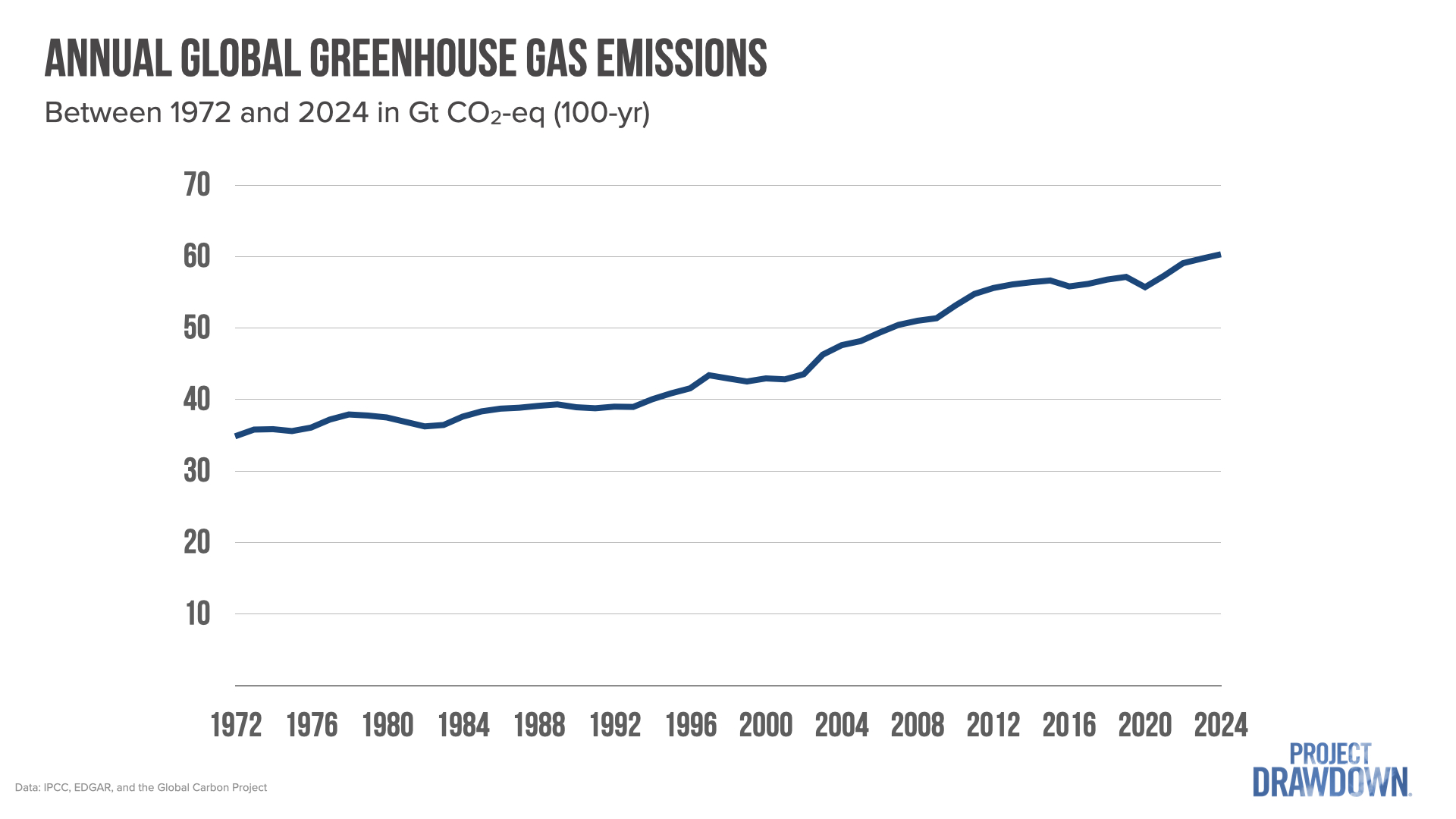
1. Nearly every year for the last half century, we have put more greenhouse gases into the atmosphere than the year before.
Here is a plot of year-on-year total global emissions, calculated in a manner consistent with the Intergovernmental Panel on Climate Change.
Just this chart alone seems to tell a simple story: as the global population grew and economies developed, we required more energy, land, and other resources, and have been acquiring them through high-emission means. But if we dig a bit deeper, the story becomes more complicated – and revealing.
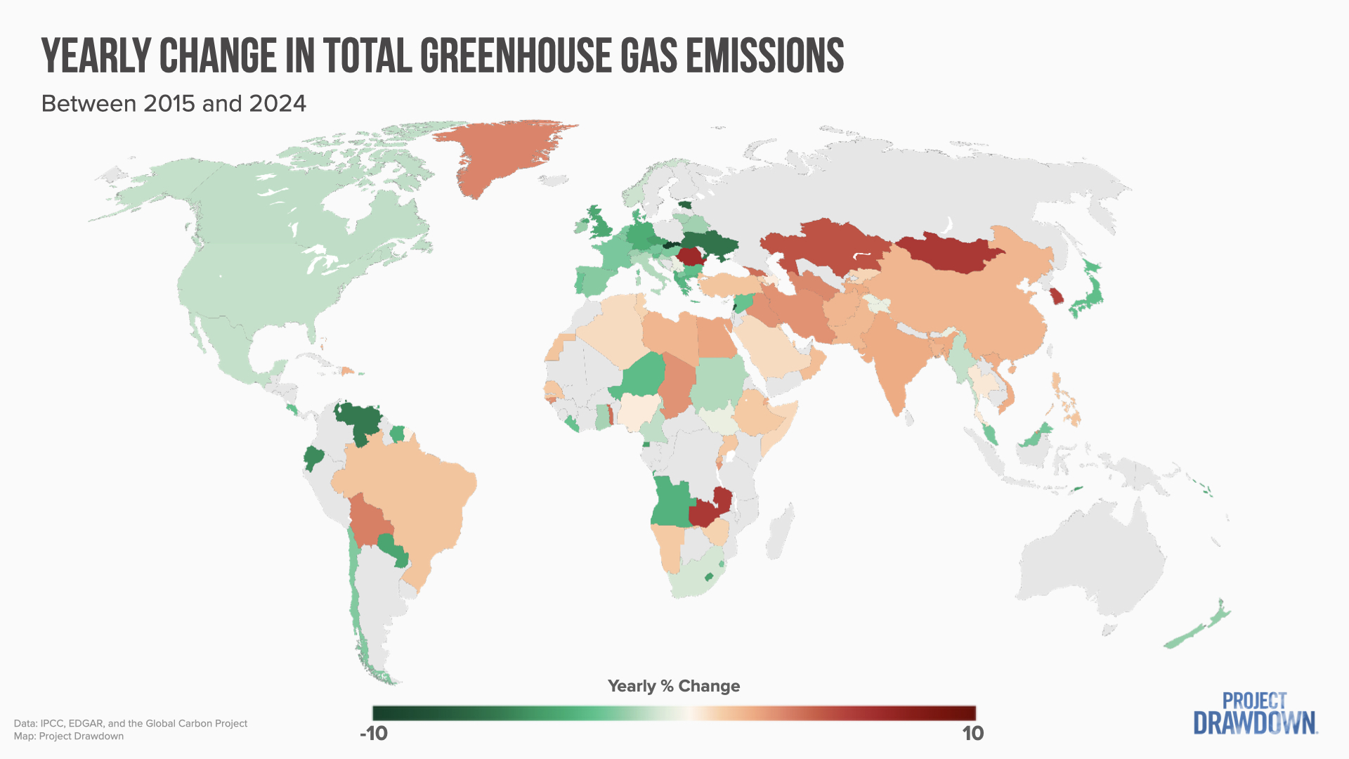
2. Countries have wildly different emissions trajectories.
Below are the yearly emissions trends over the last ten years by country.
Emissions are increasing in many places, decreasing in more than you might think, and staying relatively flat in others. In North America and most of Europe, emissions are dropping. Not everyone seems ready to accept this good news, but many countries have already reached peak emissions. And despite what doomsayers would have you believe, it’s not because high-income countries are offshoring carbon-intensive industries to other places.
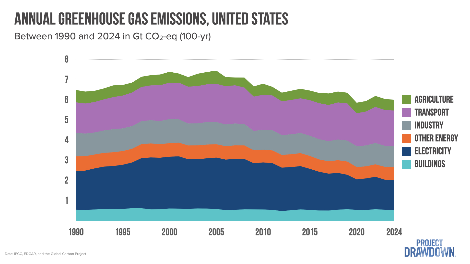
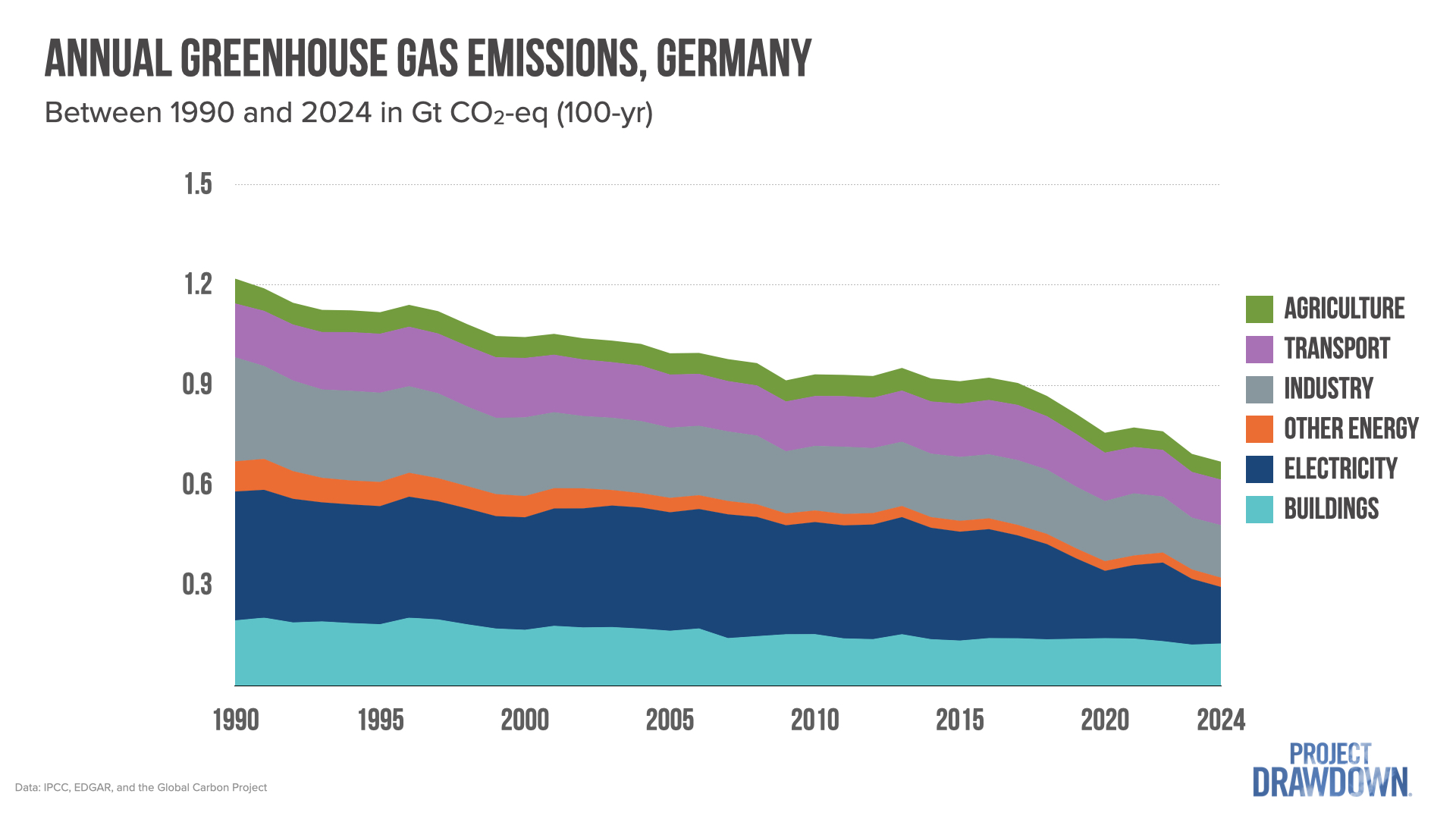
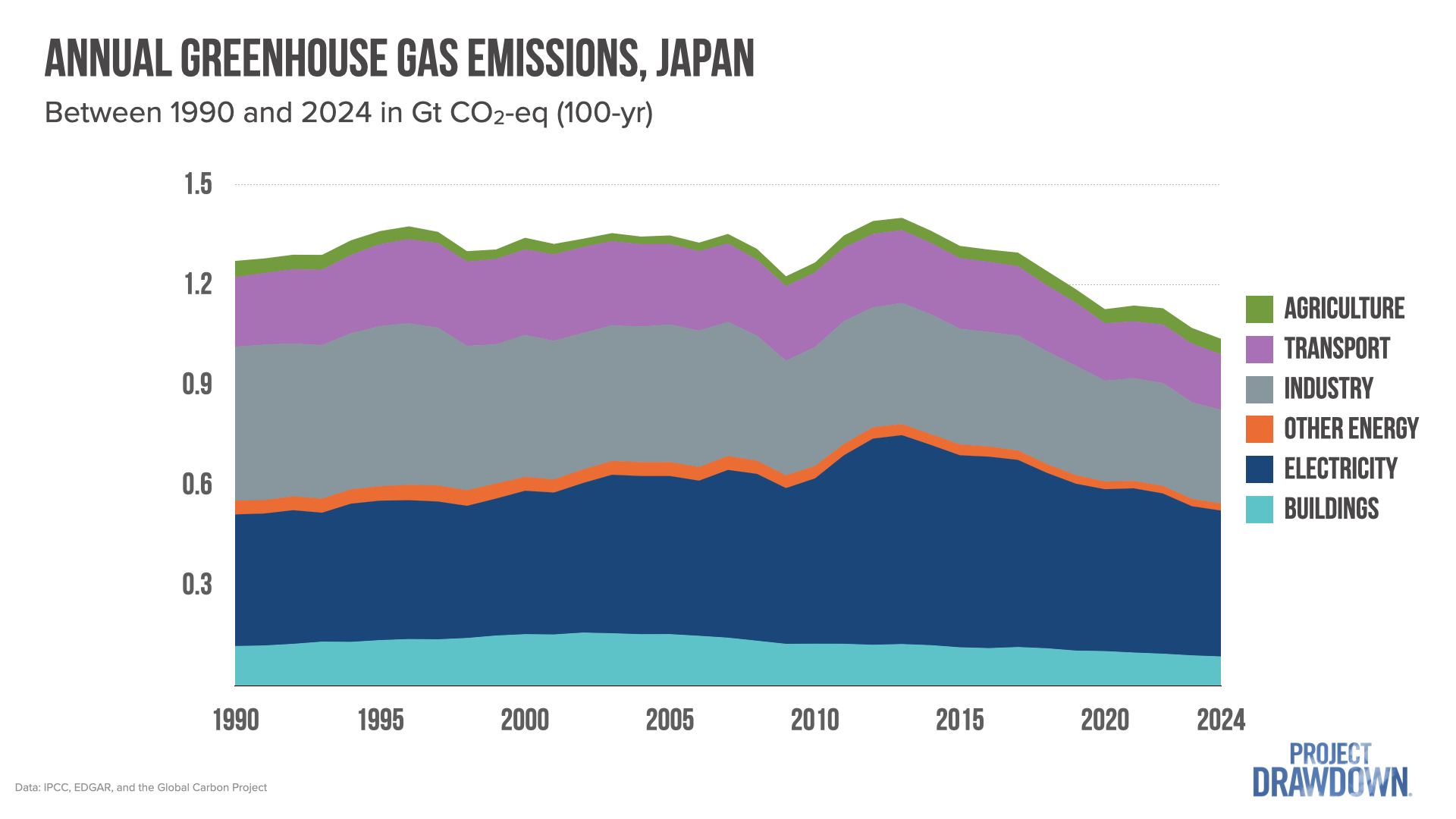
3. Many advanced economies are greening.
Let’s take a closer look at a few high-income countries with decreasing emissions to see what might explain this phenomenon.
Notice a pattern? The main story for these countries is that electricity emissions have dropped as renewables have grown and displaced dirtier fuels, particularly coal. Meanwhile, emissions in other sectors, specifically transportation and industry, are largely decreasing or have stopped growing.
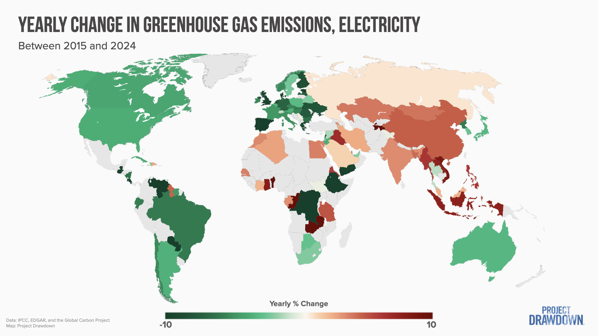
Looking at a global map over just the last decade, we can see that many places have decreasing electricity-sector emissions, notably the United States, nearly all of Europe, and much of South America.
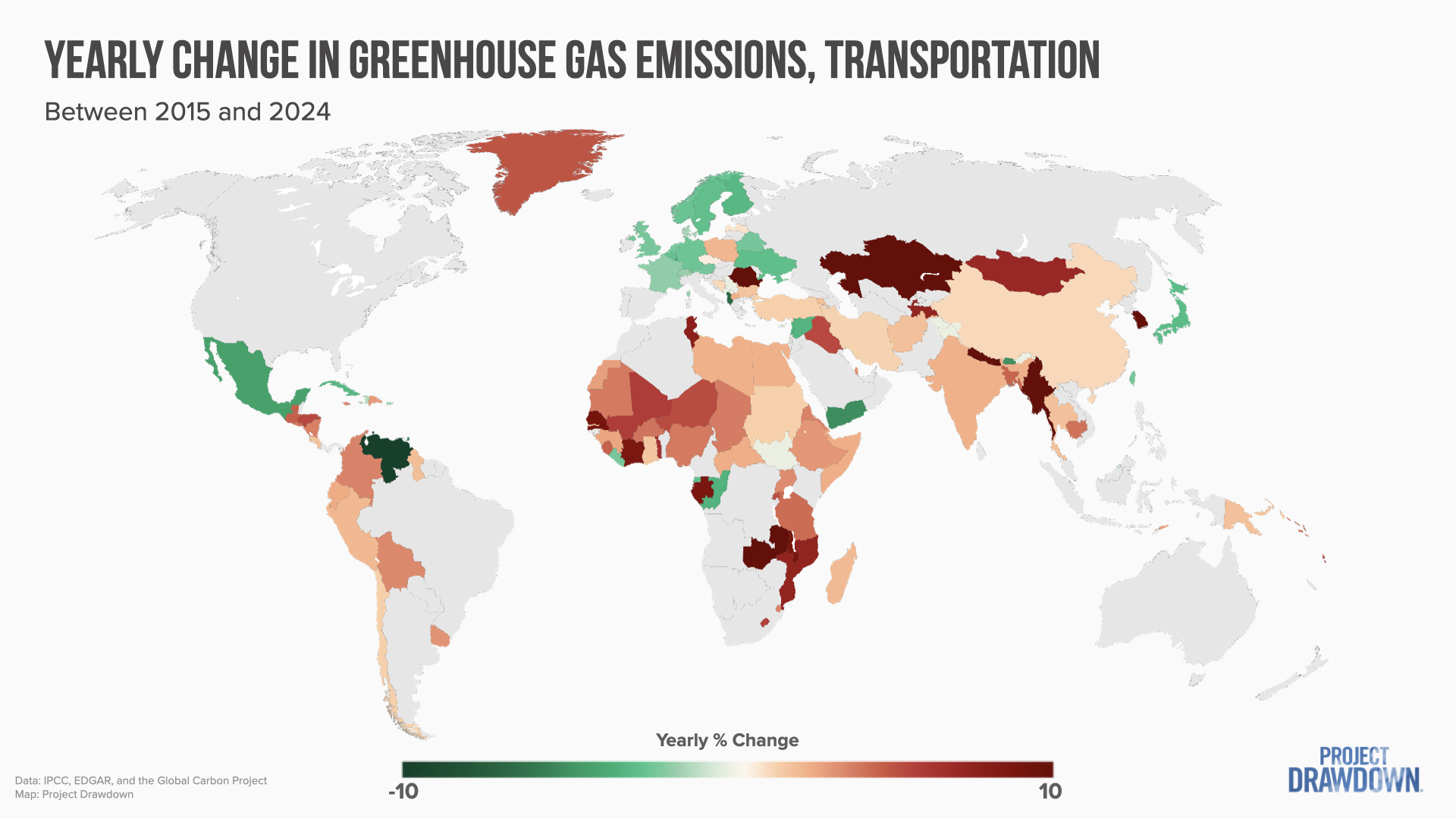
4. Though greener electricity is leading the decrease in emissions, there are bright spots in other sectors.
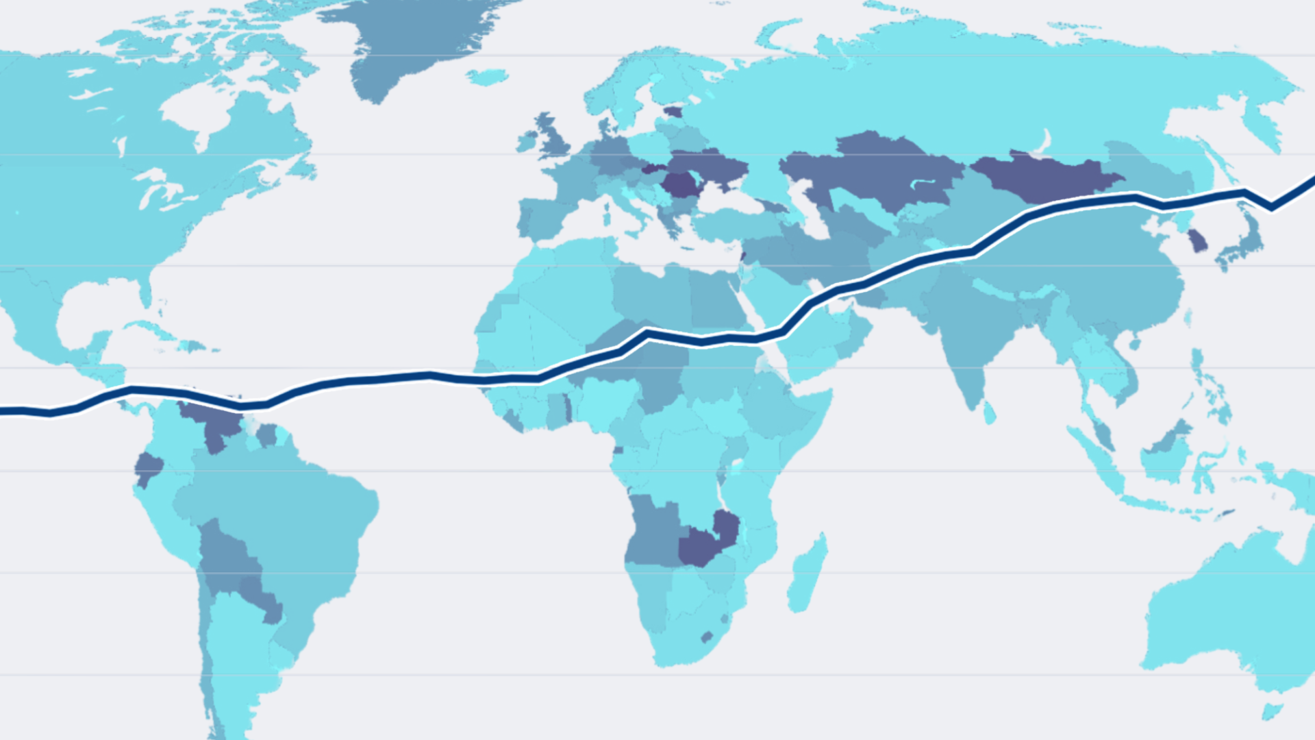
Transportation is a critical sector in which emissions, currently at 15.6% of the global total, are growing. As the map below indicates, emissions are decreasing or remaining constant in much of Europe and North America, while continuing to grow across much of the Global South.
Fortunately, this is only part of the story in emerging economies, and countries won’t have to choose between economic development and addressing climate change. Take electric vehicles in Africa, for instance, which could soon be cheaper to operate than traditional combustion vehicles. Indeed, as my last takeaway shows, low- and middle-income countries are poised to be the leaders of a more sustainable future.
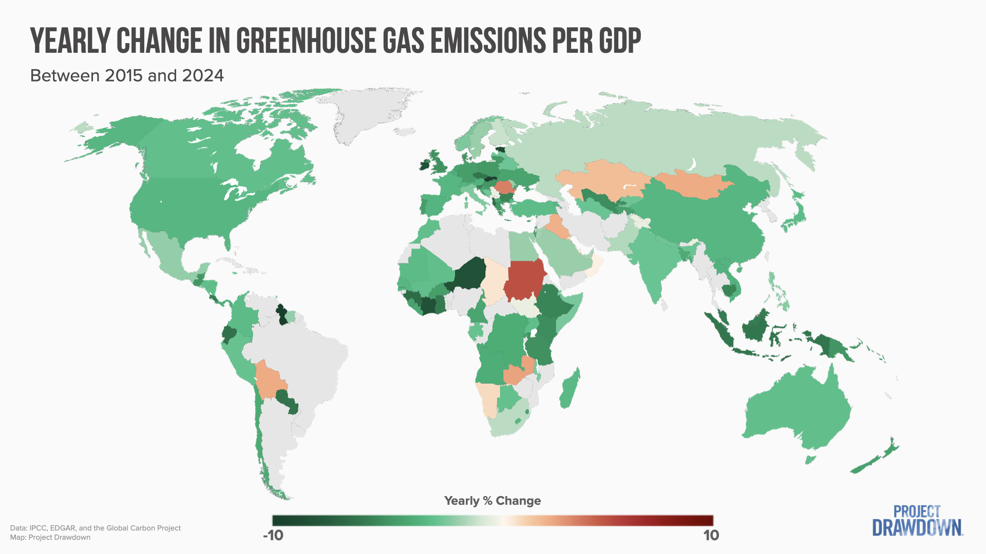
5. Economic growth no longer requires growth in greenhouse gas emissions.
In most countries around the world, economic development is outpacing growth in carbon emissions. Our friends over at Our World in Data have a great article on this decoupling of economic growth and greenhouse gas emissions. Here, I want to show a map of just how prevalent this promising trend is.
In this map, everywhere that’s green represents where emissions are decreasing relative to economic growth. It’s clear that the longstanding belief that there’s a trade-off between economic growth and emissions is now more myth than math.
The Bottom Line
So overall, what does the data tell us? Multiple countries show that national emissions can decrease with time across all sectors. Emissions in some sectors, such as electricity, are already dropping across much of the world, and even though emissions are still increasing in other sectors, there are bright spots serving as proof of what’s possible.
Perhaps most importantly, it’s clear that the struggle against climate change can take place while improving people’s economic conditions. Climate action can’t come at the cost of development, and the data shows that it doesn’t have to.
Pulling together threads from all of these charts, we have the makings of a fairly positive story with one major caveat: cumulatively, emissions continue to rise, and with them, dangerous temperatures and devastating disasters. But data can only tell us the story to a point; it shows us where we’re heading, not where we’ll end up. That’s still up to us.
James Gerber, Ph.D., is a senior scientist for data science with Project Drawdown. He has special expertise in agriculture’s impact on Earth’s ecosystems, food security, and the interrelation of climate and food security, and was lead author for the Sixth Assessment Report of the International Panel on Climate Change, focusing on development pathways. He previously worked at the University of Minnesota.
This work was published under a Creative Commons CC BY-NC-ND 4.0 license. You are welcome to republish it following the license terms.